
We’re still recovering from Covid. We have war, sanctions, shortages, inflation, recession. The world has digitalized faster than we could have imagined. Whole industrial sectors are disappearing and new ones appearing. There’s mon- ey to be made out there, but not with our old products in our old markets (the red curve).
We must transition quickly to the new world of the green curve – new products and services, new distribution channels, new customers, new business models – which are rapidly substituting for the old world. Numerous companies have failed to transform in the face of upheaval: where are Kodak and Xerox and Nokia and Marconi now? Where will airlines, carmakers, banks and publishers be in 10 years?
1. Have the rules of business changed forever?
One reaction to change is to say that we cannot learn from past evidence. The same claim was made during the 1970s oil/inflation crises, the 1980s rise of globalisation, the 1990s tech boom, the 2000s financial crisis and the 2010s “platform economy”. We strongly argue that such a reaction is wrong. The PIMS database has detailed evidence on five decades of business strategy and performance: the 1970s, the 1980s, the 1990s, the 2000s and the 2010s. Our initial claim was to have discovered the “laws of the marketplace” that were valid across different industries and geographies: but were they valid across different decades as well? PIMS proved that success comes from having competitive strength in an attractive market with a fit supply chain: have the factors really changed?
Another related question is whether, since the evidence has been out there for 50 years, has it changed the way businesses position themselves? We use the Profit Impact of Market Strategy (PIMS) database which has been established for over 40 years across a wide range of industries and geographies, currently under the wing of the Malik management centre in St. Gallen, Switzerland, containing over 25000 years of business experience at the Strategic Business Unit (SBU) level. (An SBU sells a connected set of products through particular channels to a defined customer set against a defined competitor set using a particular supply chain. This is the arena in which corporations make and implement marketing and investment decisions). Each SBU is characterized over several years by some 200 factors, including its and its competitors’ market shares, customer preference, relative pricing, service quality, innovation rate, vertical integration, etc., as well a range of market attractiveness factors and fairly detailed income statement, balance sheet, and employee data.
Let’s look at the main PIMS factors in rough order of significance:
1.1 Investment intensity
Our first chart looks at the impact of investment intensity on ROI over the five decades. In the front row we can see that businesses with investment (fixed capital at NBV plus working capital) more than 175% of value added make virtually zero ROI (EBIT as % of investment). In the back row we can see that investment of less than 55% of value added corresponds to much higher ROI. The slope from back to front is about the same in each decade.
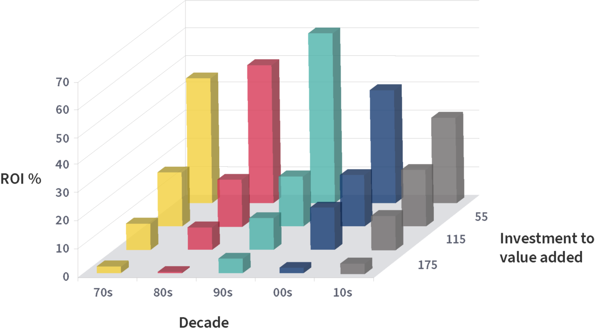
Figure 1: Investment intensity. Our first chart looks at the impact of investment intensity on ROI over the five decades. In the front row we can see that businesses with investment (fixed capital at NBV plus working capital) more than 175% of value added make virtually zero ROI (EBIT as % of investment). In the back row we can see that investment of less than 55% of value added corresponds to much higher ROI. The slope from back to front is about the same in each decade.
The strong message is that a capital-lean supply chain is best for profitability: behaviourally you make what you can sell at a good price rather than being under pressure to sell what you can make (at any price). However, there is a school of thought that book investment is no longer a good measure of the resources deployed by the business, ignoring intangibles such as brand value, intellectual property, and platform strength, so there may be an element of a pure algebra – ROI is higher because you are dividing by a lower denominator. So to make things simpler, we will focus in the remainder of this article on ROS (EBIT as % of sales revenue). The ROI impacts tend to be stronger, because many factors with a positive impact on ROS (e.g. economies of scale, faster cycle times) have a negative impact on investment intensity.
It is evident that the front row is still the lowest (in the 1980s it went negative) and the back row generally the highest. This flatly contradicts standard economic theory that firms invest to make higher margins! But it always has and still does. Please note that ROS can be affected by all sorts of other factors that are not equally distributed across bars, so there will be some unexplainable ups and downs, particularly after 2000 when there are typically dozens rather than hundreds of observations per bar.
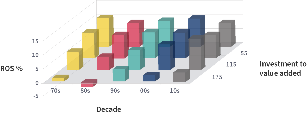
Figure 2: Investment intensity. It is evident that the front row is still the lowest (in the 1980s it went negative) and the back row generally the highest. This flatly contradicts standard economic theory that firms invest to make higher margins! But it always has and still does. Please note that ROS can be affected by all sorts of other factors that are not equally distributed across bars, so there will be some unexplainable ups and downs, particularly after 2000 when there are typically dozens rather than hundreds of observations per bar.
1.2 Relative market share
The second main profit driver is relative market share (your share divided by the three largest competitors: this is a stronger factor than either share relative to the single largest competitor or just absolute market share on its own). To get a full view we’ve sorted each decade into seven bars where the extreme bars have relatively few observations. Two things stand out: first, the effect is primarily time-independent, especially in the main range of 12.5% to 200% relative market share, where the slope remains the same. But maybe something is starting to happen at the extremes in the current century: very dominant businesses doing particularly well, and very small players being very scarce (perhaps the PIMS message is getting through and they are re-focussing on a niche where they have a decent share). This will need confirming in the 2020s.
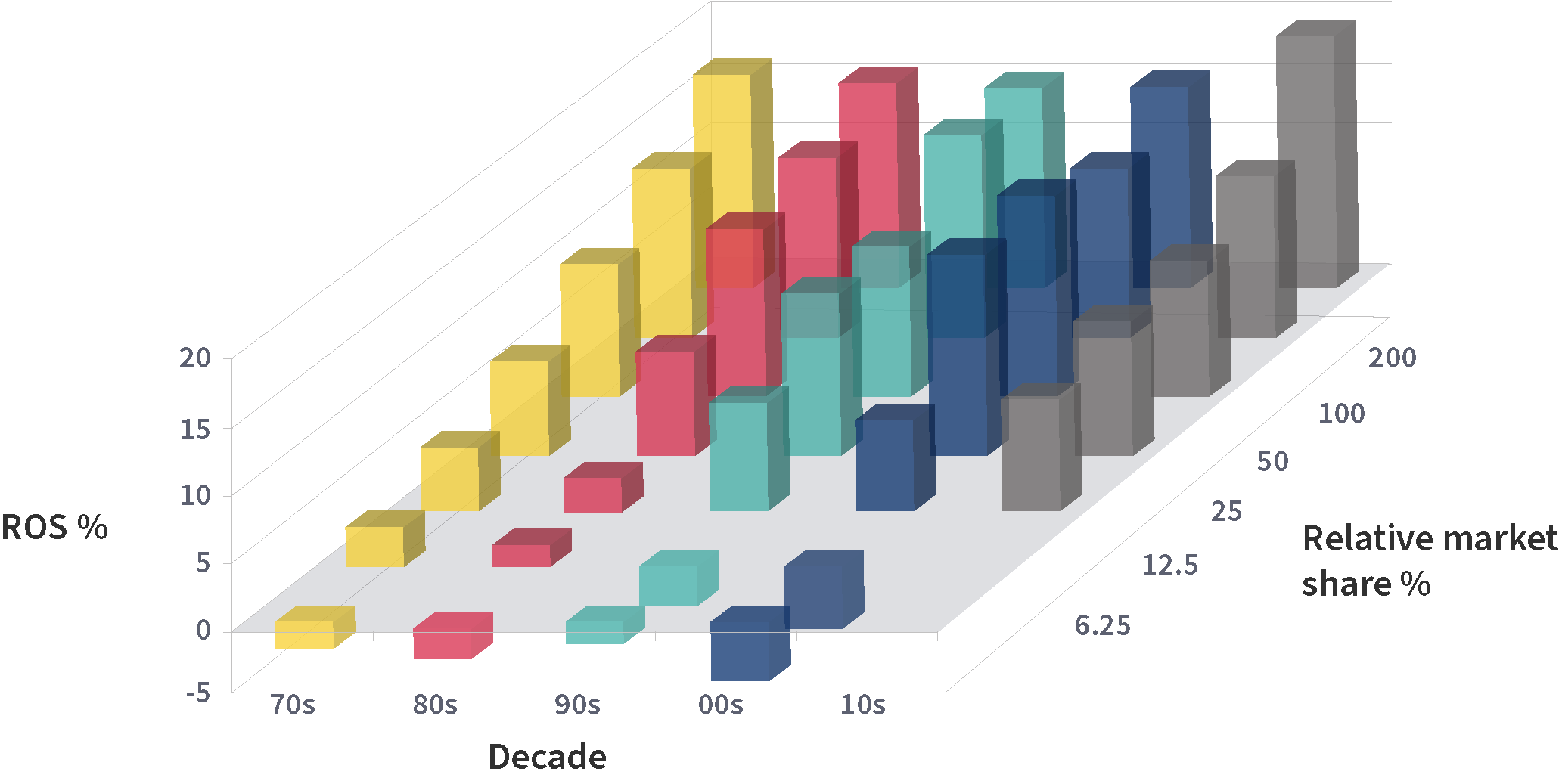
Figure 3: Relative market share. The second main profit driver is relative market share (your share divided by the three largest competitors: this is a stronger factor than either share relative to the single largest competitor or just absolute market share on its own). To get a full view we’ve sorted each decade into seven bars where the extreme bars have relatively few observations. Two things stand out: first, the effect is primarily time-independent, especially in the main range of 12.5% to 200% relative market share, where the slope remains the same. But maybe something is starting to happen at the extremes in the current century: very dominant businesses doing particularly well, and very small players being very scarce (perhaps the PIMS message is getting through and they are re-focussing on a niche where they have a decent share). This will need confirming in the 2020s.
1.3 Customer preference
The third main profit driver is what PIMS originally called relative quality, which we measure by looking at all the non-price attributes (product, service, image) affecting customer choice and weighting where you are superior against where you are inferior. Due to confusion with TQM and quality control metrics we’ve renamed it customer preference. There is some noise in the data, particularly in the 2000s (where some average businesses do quite well), but the first-order effect is the same across decades. Quality pays. As with share, we have no observations offering inferior quality in the 2010s: perhaps again the PIMS message is getting through, at least to our clients! Also, again we have the profit spike for very strongly competitive businesses.
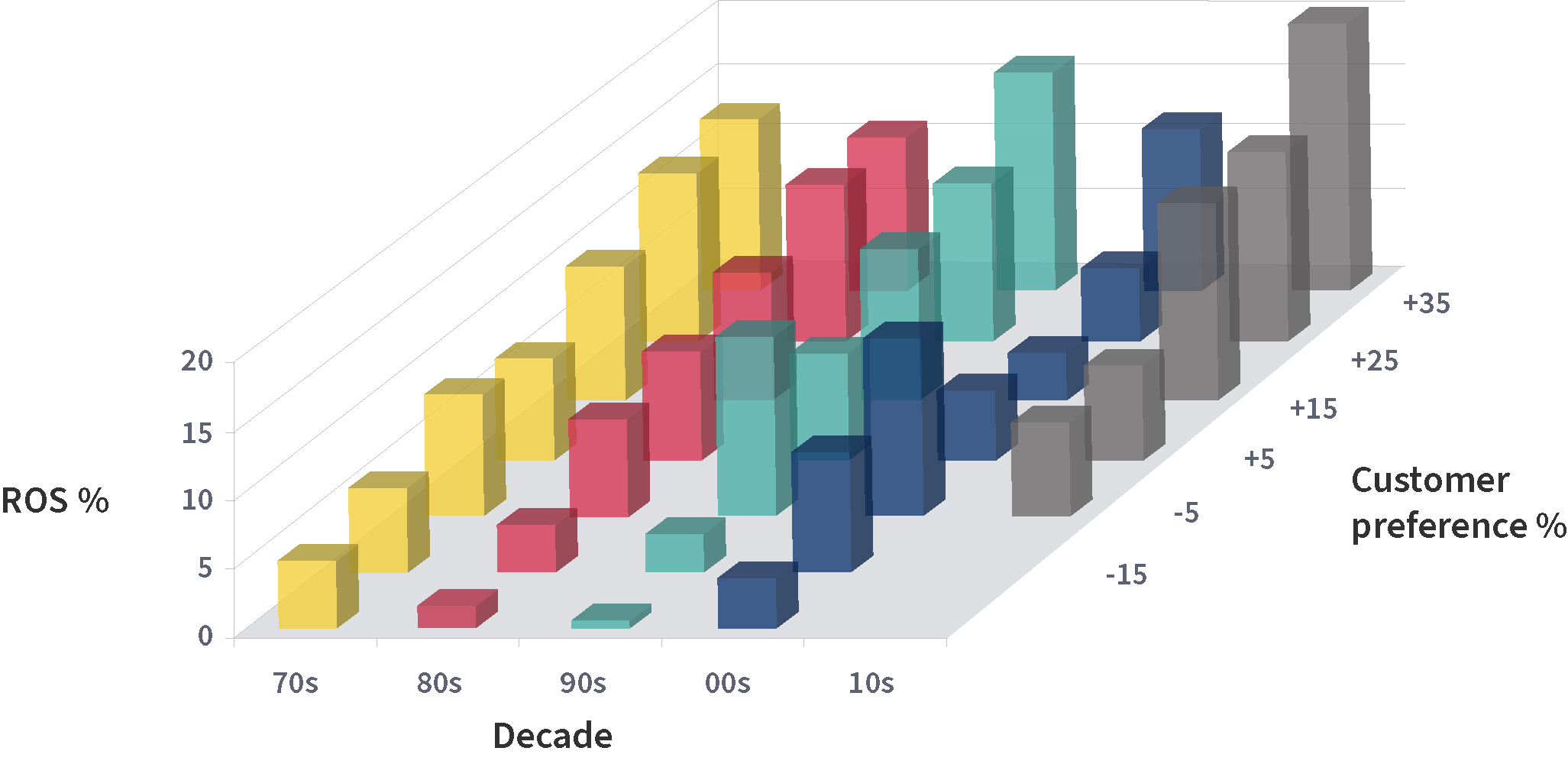
Figure 4: Customer Preference. The third main profit driver is what PIMS originally called relative quality, which we measure by looking at all the non-price attributes (product, service, image) affecting customer choice and weighting where you are superior against where you are inferior. Due to confusion with TQM and quality control metrics we’ve renamed it customer preference. There is some noise in the data, particularly in the 2000s (where some average businesses do quite well), but the first-order effect is the same across decades. Quality pays. As with share, we have no observations offering inferior quality in the 2010s: perhaps again the PIMS message is getting through, at least to our clients! Also, again we have the profit spike for very strongly competitive businesses.
1.4 Labour productivity
Factor four relates back to supply chain fitness: the value added per employee. This is measured in constant 2000 US dollars, and adjusted for high or low levels of profitability to avoid tautology. Again, there are a few wobbles, but high productivity generally pays and low productivity costs. The pattern for the 2010s is becoming familiar: we do love it when our clients do well, but we’d occasionally like some poor performing businesses to round out the research base!
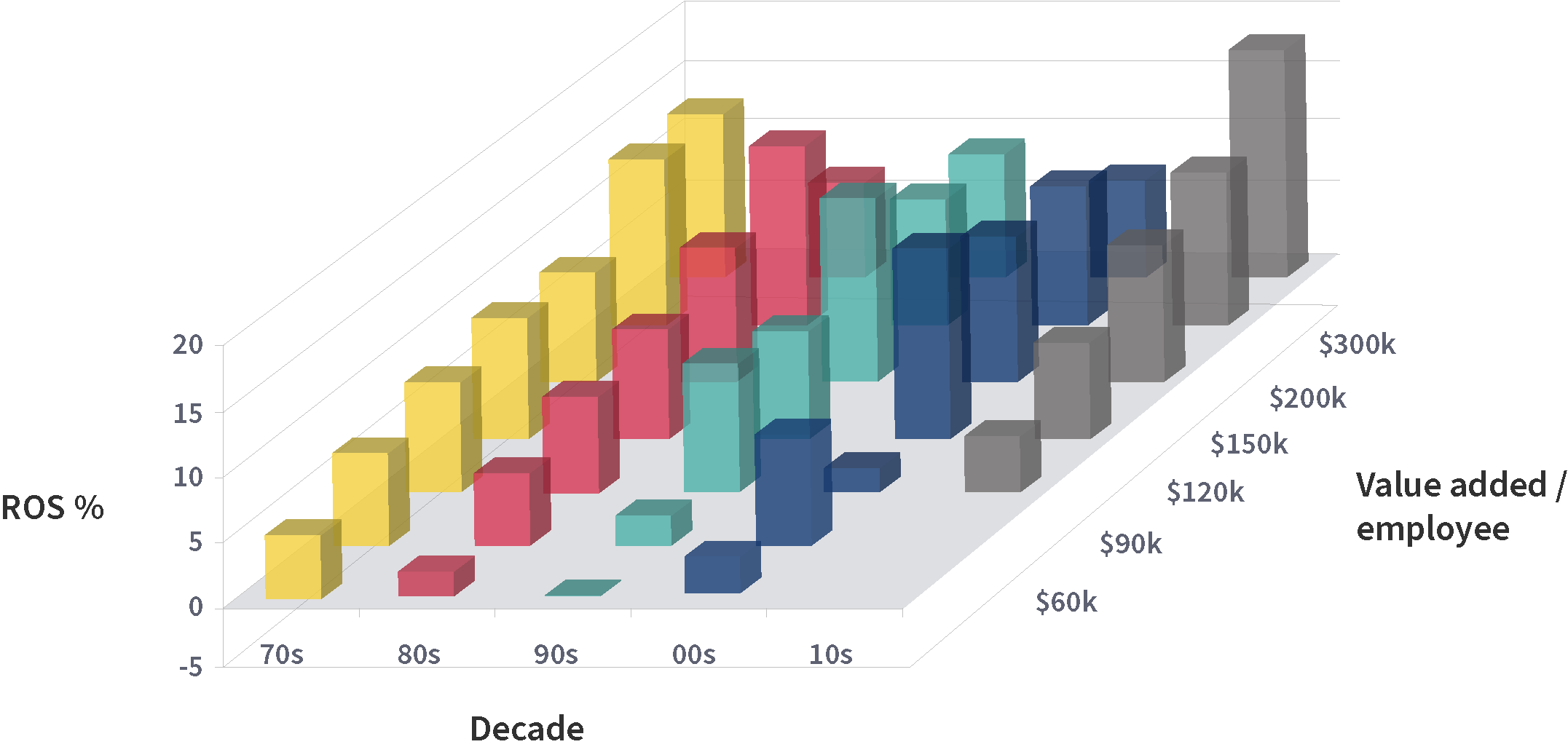
Figure 5: Labour productivity. Factor four relates back to supply chain fitness: the value added per employee. This is measured in constant 2000 US dollars, and adjusted for high or low levels of profitability to avoid tautology. Again, there are a few wobbles, but high productivity generally pays and low productivity costs. The pattern for the 2010s is becoming familiar: we do love it when our clients do well, but we’d occasionally like some poor performing businesses to round out the research base!
1.5 Innovation
We measure innovation by the percentage of sales coming from step-change products launched in the previous three years. Line extensions (different sizes, colours, flavours, pack types etc.) don’t count. The historic message from PIMS has been that a middling level of innovation is best: and indeed on the chart the peak in each decade is between 4% and 16% new products. Very high innovation (>64% on the chart) tends to be expensive. Since 2000 we have only a very few observations with >64% new products – but the one or two that do (not shown) actually have good ROS, perhaps an indication that in the new software-driven century innovation can be less burdensome. Certainly, in the post-pandemic world, so much has changed that innovation is essential. We will revisit innovation in Section 3 below.
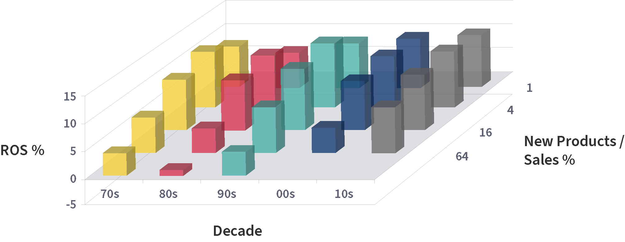
Figure 6: Innovation. We measure innovation by the percentage of sales coming from step-change products launched in the previous three years. Line extensions (different sizes, colours, flavours, pack types etc.) don’t count. The historic message from PIMS has been that a middling level of innovation is best: and indeed on the chart the peak in each decade is between 4% and 16% new products. Very high innovation (>64% on the chart) tends to be expensive. Since 2000 we have only a very few observations with >64% new products – but the one or two that do (not shown) actually have good ROS, perhaps an indication that in the new software-driven century innovation can be less burdensome. Certainly, in the post-pandemic world, so much has changed that innovation is essential. We will revisit innovation in Section 3 below.
1.6 Market growth
To many people, the most surprising PIMS finding has been how weak a profit driver is real market growth (i.e. correcting for inflation). Looking across the decades, the impact appears to be weak in the 1970s, increase a bit in the 1980s, wobble around for 2 decades, then maybe strengthen again in the 2010s. We see a profit spike at very high growth, and a steep decline at the low end. The message is however the same: it’s better to be in a growing market, but it’s not as important as competitive strength or supply chain fitness.
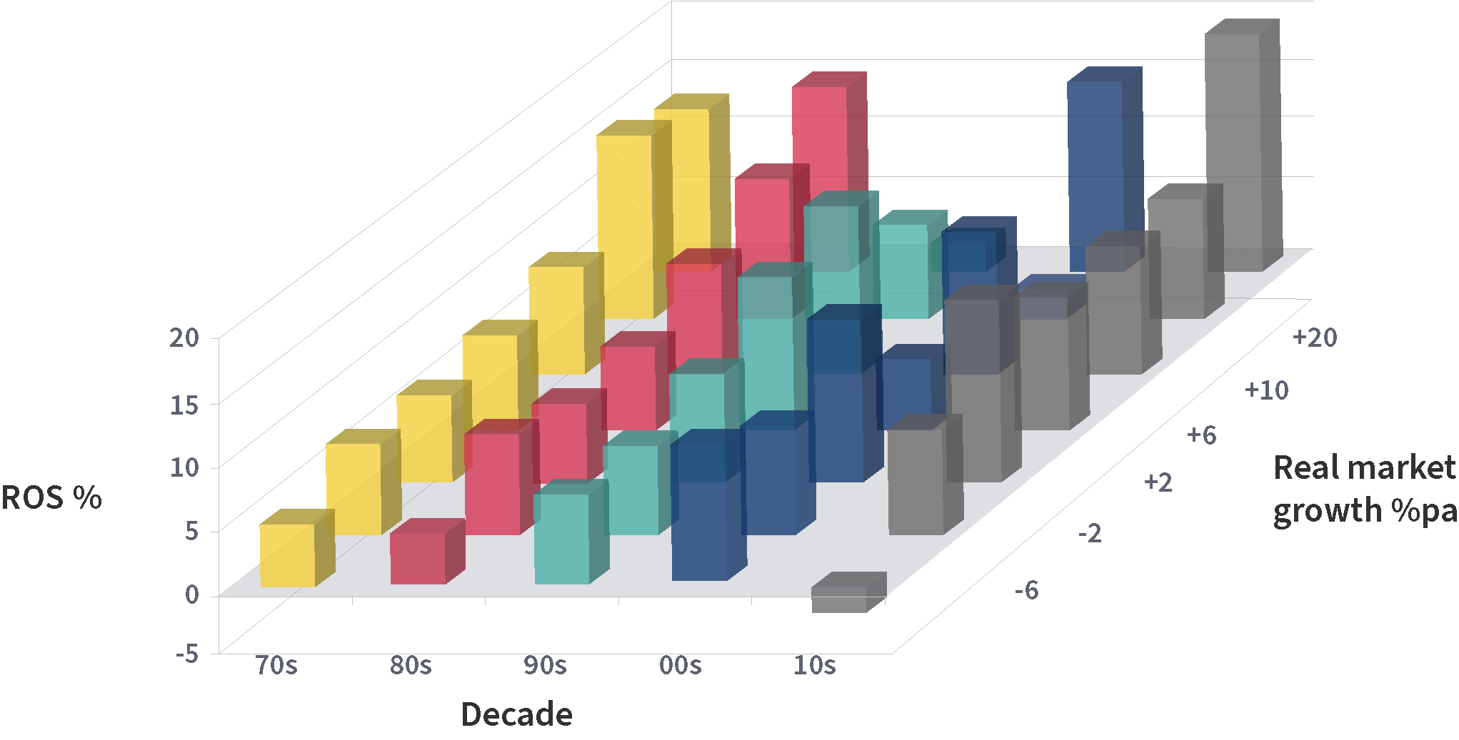
Figure 7: Market growth. To many people, the most surprising PIMS finding has been how weak a profit driver is real market growth (i.e. correcting for inflation). Looking across the decades, the impact appears to be weak in the 1970s, increase a bit in the 1980s, wobble around for 2 decades, then maybe strengthen again in the 2010s. We see a profit spike at very high growth, and a steep decline at the low end. The message is however the same: it’s better to be in a growing market, but it’s not as important as competitive strength or supply chain fitness.
1.7 Conclusion
The laws of business success have changed less than the pundits would have us believe. Having competitive strength in attractive markets with lean supply chains always pays, wherever we are in the boom/bust/inflation cycle.
2. But do simple correlations prove anything, or give reliable benchmarks for future plans?
Correlations do not prove causation: all they show is the key differences that make a difference – so they tell you from whom you can learn when considering what changes to make and quantifying their effects.
2.1 Identifying valid benchmarks over time
You should learn from winning versus losing look- alikes (businesses that have faced similar competitive positions, similar market attractiveness and similar labour / capital intensity). It is important to match on underlying structural factors but not on growth and profitability – that is what distinguishes the winners from the losers. Learn from the winners (where they differ from the losers) and derive benchmarks from them for costs, productivity, innovation, growth and profitability.
Most corporations want to invest in winners, preferably in large, growing, profitable markets. They spend considerable sums with consultants to get good estimates of market sizes, growth rates, and profitability. Unfortunately the evidence is that investing on that basis is exactly as good as investing in the opposite, or indeed investing at random. The evidence is that investment success is primarily determined NOT by market size and profitability (while market growth has a small positive impact), but instead by competitive strength, innovation and supply chain fitness, plus some market attractiveness factors.
Also, many corporations spend money to benchmark against their strongest competitors. In itself, that is not a bad idea, since they are who you have to compete against. However, it is a bad idea to copy your most successful competitors: the military analogy would be to say “who has the strongest army, what terrain are they best at fighting on, let’s attack them there!” (a recipe for annihilation).
If you are David up against Goliath, you should look for other Davids who have succeeded against their Goliaths; if you are market leader, you should look at analogous market leaders who have strengthened further. True creativity comes from beyond the “herd instinct” of your particular sector.
2.2 Multivariate modelling
Our findings are backed up by multivariate statistical methods, and we only count factors as significant when they are still significant taking into account the effects of all other factors (which may or may not be correlated). One concept we find useful is “par” – the expected profitability of a business with your competitive strength, market attractiveness and supply chain fitness. We regularly update the par profit equation in the light of new data and new statistical methods, but the main factors remain pretty constant.
Par was developed as a benchmark for current profit potential. However, two statistical findings have completely astonished us by their strength and constancy over time, namely that putting extra investment into businesses with low versus high actual profits makes no difference to success, whereas putting extra investment into businesses with low versus high par profits makes a considerable difference – despite the high correlation between actual and par profit.
The astonishing finding is detailed in this chart, which takes a little time to explain.
- Businesses investing heavily: net assets (capital employed) growing faster than 20% per annum over the 4-year period.
- Businesses investing somewhat: net assets growth 10% to 20%pa.
- Businesses investing modestly: net assets growth 0% to 10%pa.
- Businesses disinvesting: net assets declining over 4 years.
The fourth group has been omitted from the analysis since we are interested in where to invest, not in where to disinvest. Each remaining group is one line on each chart.
For the left hand chart, the businesses are lined up along the horizontal axis according to their ROI (EBIT as a % of net assets) at the beginning of the four years: those with negative ROI worse than -10% are on the left, then those with -10% to 0%, and so on in increments of 10% to the right hand group with positive ROI greater than 50%.
IRR measures the shareholder’s growth in wealth for buying the business in 1 year, running it for 4 years and getting its free cash flow, and selling it in year 4. For all rates of investment growth, the slope for wealth creation vs. beginning par is much steeper than the slope for wealth creation vs. beginning actual.
Figure 8: IRR. IRR measures the shareholder’s growth in wealth for buying the business in 1 year, running it for 4 years and getting its free cash flow, and selling it in year 4. For all rates of investment growth, the slope for wealth creation vs. beginning par is much steeper than the slope for wealth creation vs. beginning actual.
There is a certain amount of up-and-down zig-zag due to limited sample sizes, but the trend is clear: the lines are basically flat, it is generally no better to invest in a business starting at plus 50% ROI than one starting at minus 10% ROI; only the really heavy investors show a slight positive slope. Investing in “winners” means you always invest at the peak of the cycle, you never invest in a start-up business, but occasionally you hit the spot. You might as well use a dartboard for investment decisions.
For the right hand chart, the businesses are lined up horizontally instead according to their par ROI at the beginning of the four years. This is their expected ROI based on a model of their competitive strength, innovation, market attractiveness, and supply chain fitness. Although correlated 80% with actual ROI, nevertheless the order is different enough to show remarkably different results. All three lines have a strong positive slope, with the slope strongest for the heavy investors. So although the par ROI equation was developed mainly as a diagnostic benchmark for current profitability, it turns out to be the best predictor available for future investment success. Competitive strength and supply chain fitness have the biggest weights in the par ROI equation (each of those categories is captured in 6 or more different metrics).
Another reason for leaving the disinvestors off the chart was graphical noise and confusion. The picture is quite muddled. In theory it should create wealth to take cash out of a bad business and destroy wealth to disinvest in a good business; however quite a few high-par businesses create wealth even for those stupid enough not to invest in them, so the statistics are inconclusive. Vice versa, it is more fruitful to sell a low-par business than run it for cash (the buyer will buy on the basis of actual ROI.
2.3 Conclusion
Rather to our surprise, it is clear that par profit (a combination of competitive strength, market attractiveness and supply chain fitness) is the key driver for successful future investment. The time series nature of the finding shows this is causation not just correlation. Any company investing in a business without knowing its par and benchmarking against strategic peers is flying blind.
3. Innovation: can there be gain without pain?
There’s money to be made out there, but not with our existing products. Innovation is crucial, but how do we manage the tradeoff of spending development money today and staying alive till tomorrow?
Well, we have some tips for navigation that might help. In the PIMS database we have plenty of examples of businesses going through such trials with varying degrees of success, and there are lessons to be learnt. First, let’s look at some of the big differences between innovative and less-innovative businesses. In PIMS we have found the best metric for innovation is the percentage of sales coming from new products, where a “new” product represents a step change from a customer or technological point of view, and is the result of a product development process that has led to a change in production technology, separate product management or new customer application. Minor improvements, product line extensions or aesthetic changes are not “new” products.
3.1 The big tradeoff
In the charts below we have split the database into five bands, those with less than 1% of sales from new products, 1% to 4%, 4% to 16%, 16% to 64%, and 64% to 100%.
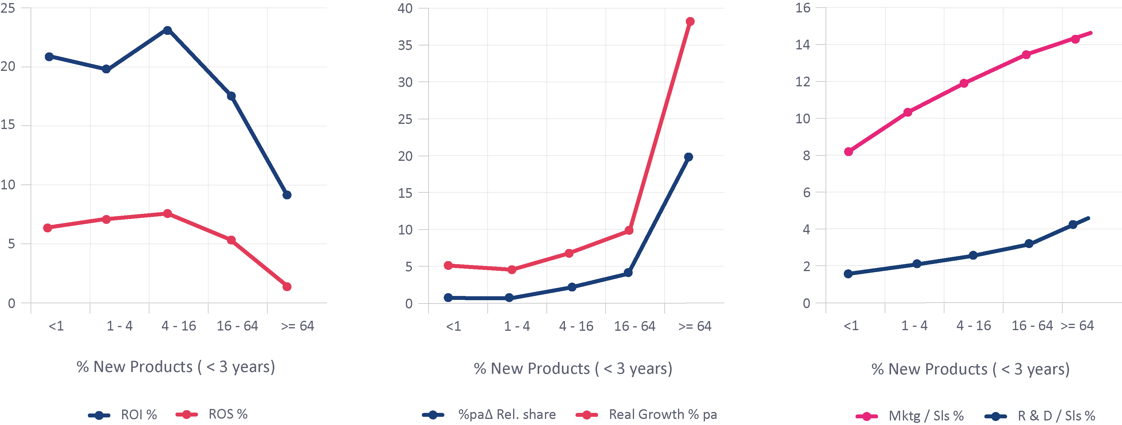
Figure 9: The Big Trade-Off. In the charts below we have split the database into five bands, those with less than 1% of sales from new products, 1% to 4%, 4% to 16%, 16% to 64%, and 64% to 100%.
The first chart shows profitability for each band (two metrics: return on investment: EBIT as % of trading capital, and return on sales: EBIT as % of sales). In both cases the peak is the band 4% to 16%, so for profitability it is possible both to under-and over-innovate, but the real dip comes at very high innovation. The middle chart shows growth (real sales growth: %pa growth in sales at constant prices, and %pa change in relative market share: you / big 3 competitors). Higher innovation helps growth, especially at the highest level. The third chart looks at two costs related to innovation: on average each quadrupling of innovation rate increases R & D costs / sales by around 1 percentage point and marketing (including salesforce) costs / sales by around 2 percentage points.
The conclusion is that more innovation is generally a good thing up to 16% of sales: the extra costs of R & D and marketing are more than rewarded by the marketplace. Above 16% there is a tradeoff between profitability and growth: massive radical innovation can be fantastic for the top line but ruinous for the bottom line. The extra growth in the middle chart doesn’t compensate for the falloff in profitability in the left chart.
3.2 Lessening the tradeoff
So are there any situations where high innovation can co-exist with healthy profits and rapid growth? Yes, here are five examples:
- Focus on customers who love you most. In the charts below we have split the database between three levels of innovation (cutpoints 8% and 32%) and three levels of customer preference*. The leftmost points are businesses where customers are indifferent or prefer competitors, the middle points are those businesses which customers generally prefer, and the rightmost points are those who are outstandingly superior. We look at ROI, relative market share gain, and marketing plus R&D spend / sales:
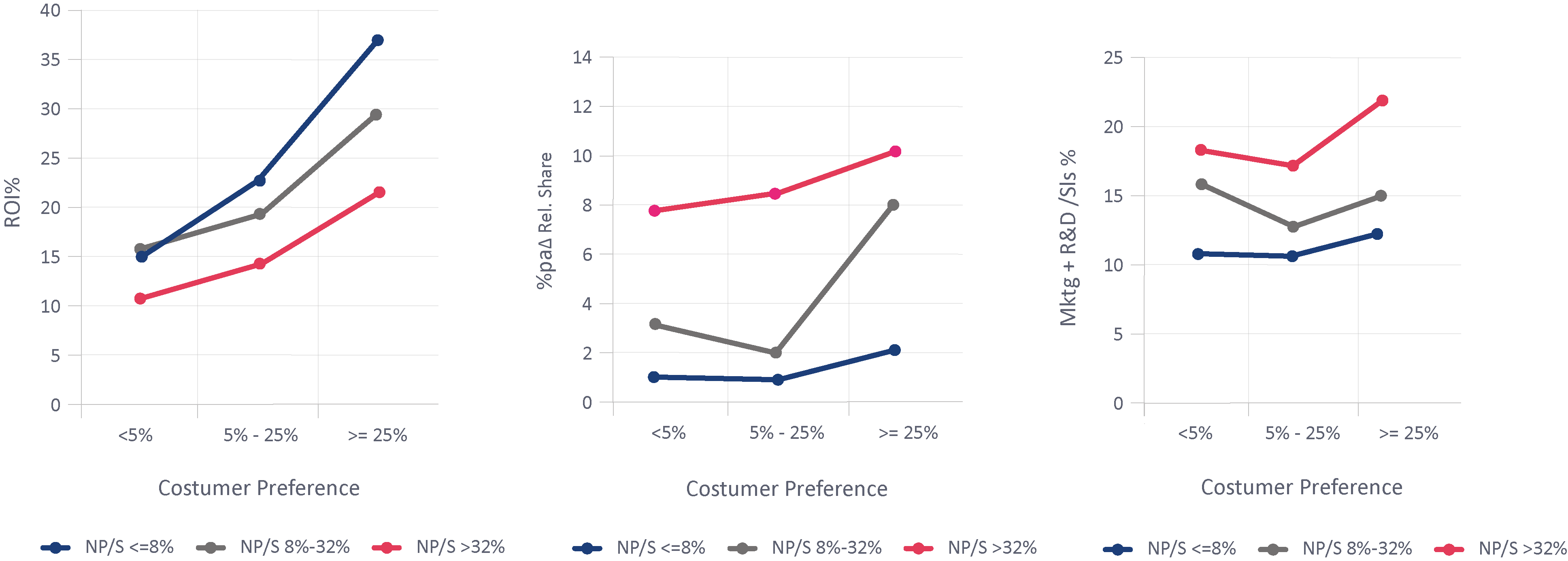
Figure 10: Focus on customers who love you most. In the charts below we have split the database between three levels of innovation (cutpoints 8% and 32%) and three levels of customer preference*. The leftmost points are businesses where customers are indifferent or prefer competitors, the middle points are those businesses which customers generally prefer, and the rightmost points are those who are outstandingly superior. We look at ROI, relative market share gain, and marketing plus R&D spend / sales:
The evidence is that where customer preference is high, you can innovate and achieve decent profits and growth, with at worst a minor hit on marketing and R & D spend. Note that PIMS customer value analysis looks at all factors affecting customer choice: the preference score is the weighted % of non-price attributes where you are preferred to competitors minus % where you are inferior. The cutpoints used are deliberately set high: +5 and +25.
- Utilize under-utilized assets. Here we just have two columns: businesses not filling up versus filling up spare capacity (cutpoint = 1.5% points change in capacity utilization per annum):
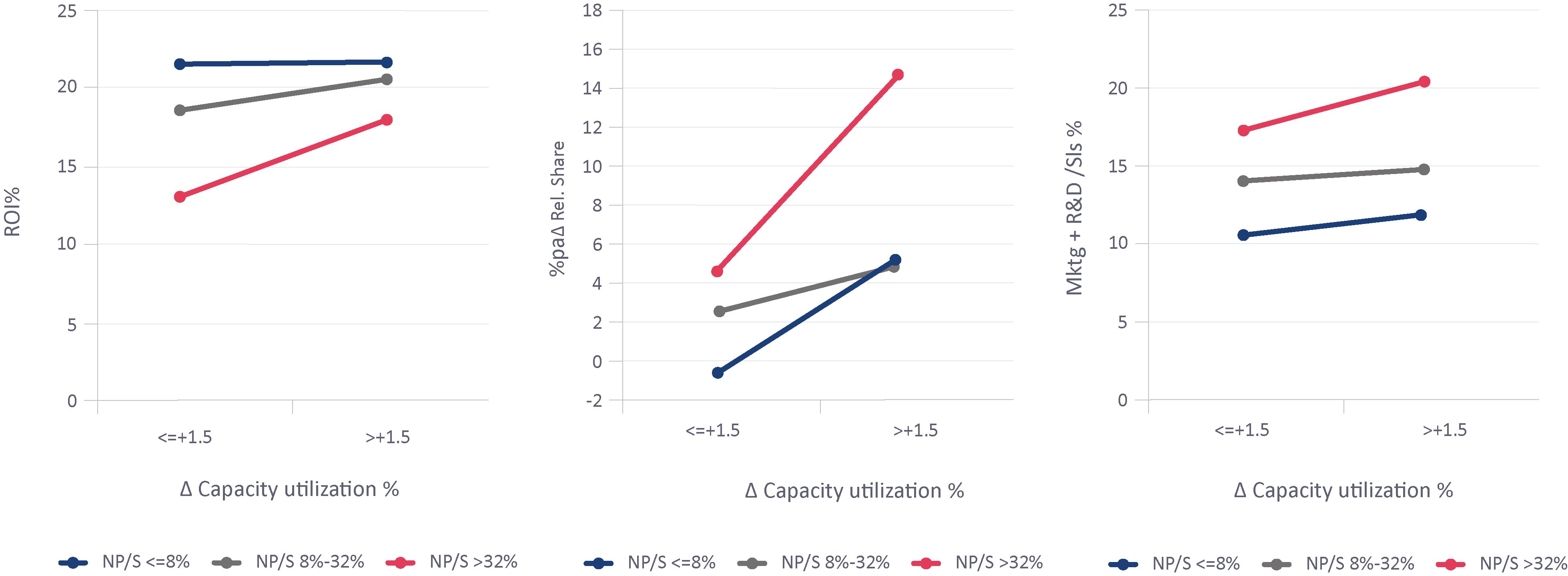
Figure 11: Utilize underutilized assets. Here we just have two columns: businesses not filling up versus filling up spare capacity (cutpoint = 1.5% points change in capacity utilization per annum):
The evidence is that you should focus innovation efforts on things you can make using idle assets. For high-innovation businesses, there is a strong ROI and share gain benefit. There is a modest hit on marketing and R & D costs, but they more than pay off.
- Out-innovate competitors. The two columns are: less innovation than competitors and more innovation:
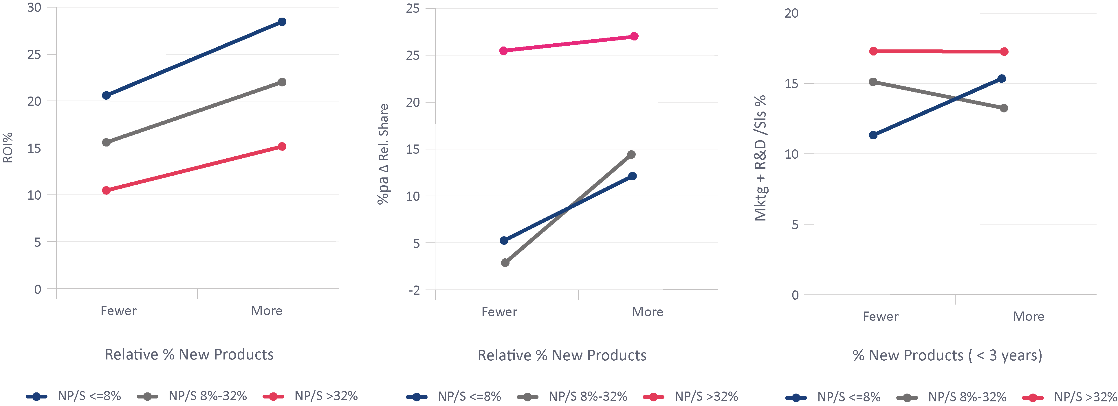
Figure 12: Out-innovate competitors. The two columns are: less innovation than competitors and more innovation
The evidence is that for all levels of innovation, it is more profitable to out-innovate competitors, more rewarding in terms of share gain, and that comes without any particular penalty in terms of marketing plus R&D cost. Of course, if your competitors have read this article, they will be trying to out-innovate you, so you have to be smarter than them.
- Don’t chase after growth segments. We’ve split between markets with zero or negative real growth versus growing ones.
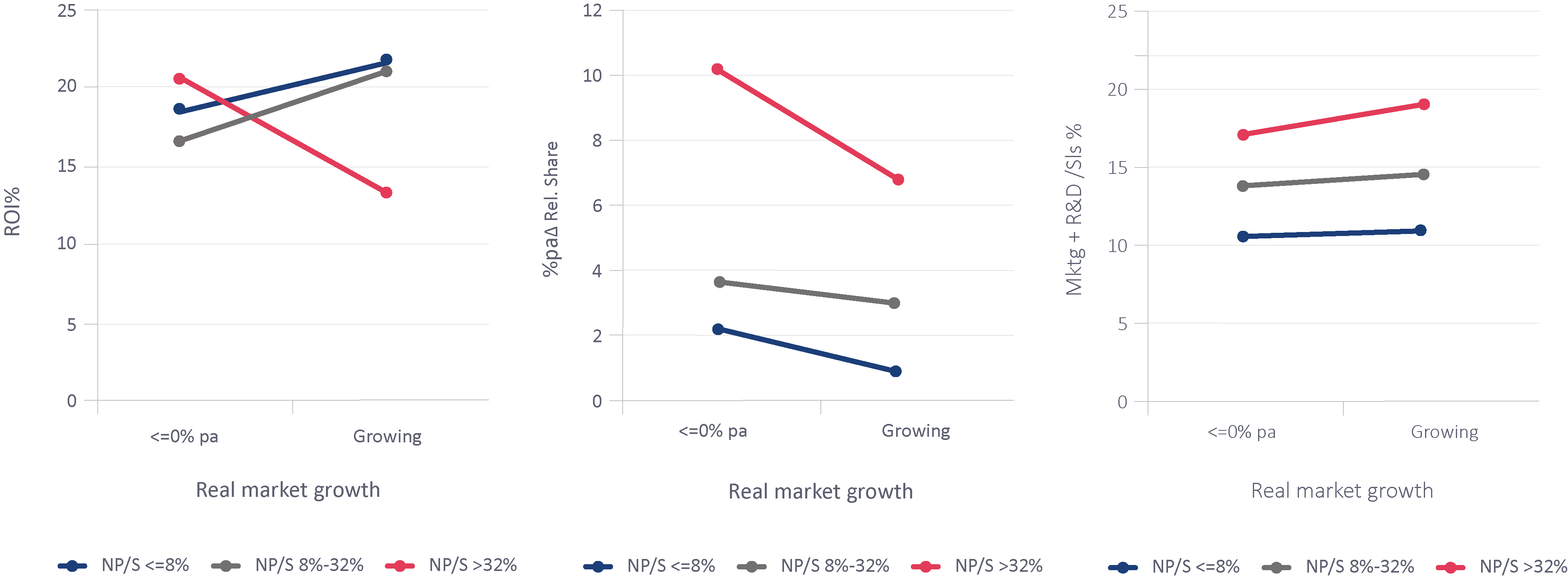
Figure 13: Don’t chase after growth segments. We’ve split between markets with zero or negative real growth versus growing ones.
We can see that innovators in growth markets are less profitable and less successful in gaining share (probably because that’s where all the competitors are focussing too). The requirements for marketing and R&D are higher too. Don’t overlook innovation opportunities in unfashionable market segments.
- Think custom. Here we’ve split between businesses producing standardised products and services versus those who customize and produce to order for a particular customer.
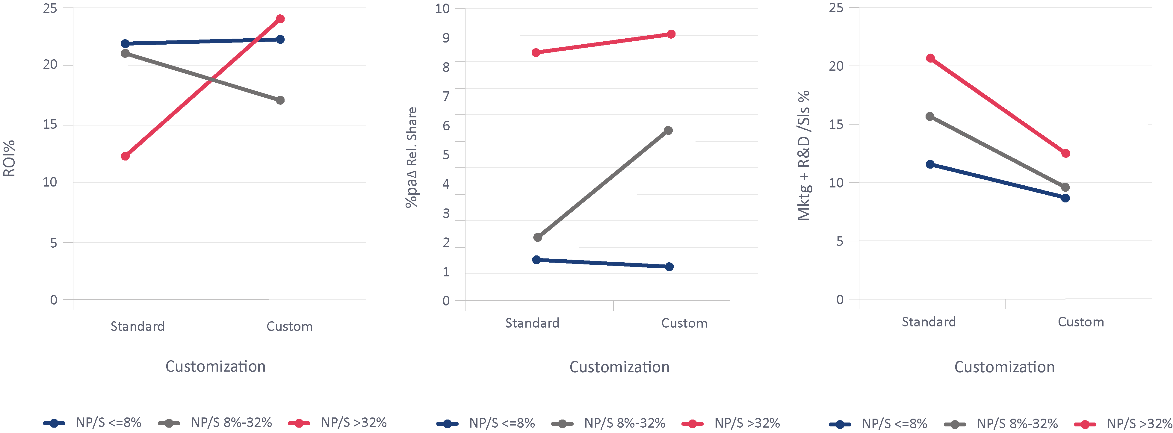
Figure 14: Think custom. Here we’ve split between businesses producing standardised products and services versus those who customize and produce to order for a particular customer.
High innovators who can customize get benefits to profitability, share gain, and marketing plus R & D spend. You may say this is impossible for you – and you may be right – but increased digitalization does surely allow this possibility for a wider range of businesses than previously.
- Additional factors. There are clearly other factors that either magnify or ameliorate the tradeoff between profitability now and innovation and growth for the future, some of which will only apply to particular business models. A full analysis against the PIMS evidence base can tell you what will apply in your particular situation.
3.3 Disavow simplistic nostrums
You may come across people telling you to measure R & D and innovation effectiveness by focusing on two particular ratios:
- RDP – “R&D to New Product Conversion Rate” – % of Sales from New Products / (R&D/Sales %).
- NPM – “New Products to Margin Conversion Rate” – % of Gross Margin from New Products / % of Sales from New Products.
These are wrong in theory, not related to any empirical evidence, and misleading in practice. RDP at first blush makes some sense. However, it assumes all R&D is aimed at developing new products, and that the R&D and the
innovation happen simultaneously, both of which are demonstrably false. Much R & D is productively aimed at cost reduction, quality improvement, fundamental understanding, etc.. Nor is it true that a company spending 1% of sales on R & D and achieving 4% New Products (RDP = 4) is innovating better than a company spending 5% on R & D and achieving 15% New Products (RDP=3). The chart in 3.1 above clearly shows that innovation is not a simple linear function of R & D spend (or indeed of marketing plus R & D, which might make a bit more sense).
NPM is also spurious: it assumes that the only purpose of a new product is to have a higher % gross margin than existing products. But often the goal is market share: a new product offering great value to the customer may not produce a great gross margin as a % of sales, but will compensate by selling in large quantities and gaining new customers. In the other direction if a new product is severely over-priced it will score well on NPM, while under-achieving In terms of growth or requiring massive marketing spend. In fact both RDP and NPM can be artificially inflated by huge marketing spending, since that has positive impacts on sales and gross margin at the expense of the bottom line. Our evidence is that, in reality, marketing is twice as important a consideration in innovation strategy as R & D.
3.4 Conclusion
There will be enormous opportunities, and big winners and losers, as we fight our way through and out of the current crisis. Innovation will be crucial, and the winners are likely to be the businesses that focus on customer preferences, utilize under-utilized assets, out-innovate competitors, think custom, avoid the herds chasing over-hyped growth markets, and benchmark marketing and R&D spend against winning “look-alikes”.
Please click here to download the article as a PDF.


A person necessarily help to make significantly articles I might state. That is the very first time I frequented your web page and to this point? I amazed with the research you made to make this particular publish extraordinary. Fantastic job!