Most corporations aim to invest in “winners”, preferably in profitable businesses in large and growing markets. They spend considerable sums with consultants to get estimates of market sizes, structures and detailed growth rates for the years ahead. Also, they do simple business planning, mostly linearly extrapolating the past’s top line and margin developments and forecasting optimistic improvements in working capital.
Unfortunately, the evidence is that allocating capital, marketing and R&D investments on that basis, or on current performance, is no better than investing at random. In addition, many corporations spend money on conventional league table benchmarking against their strongest competitors. In itself, that is not a bad idea, since they form the actual competition. However, it is a bad idea to copy the most successful competitors: the military analogy would be to say “who has the strongest army, what terrain are they best at fighting on, let’s attack them there!”. If you are David up against Goliath, you should look for other David’s who have succeeded against their Goliaths; if you are market leader, you should look at strategically analogous market leaders who have strengthened further. True creativity comes from beyond the “herd instinct” of the particular sector. The key findings are derived from the following chart, which might need a bit of explanation.
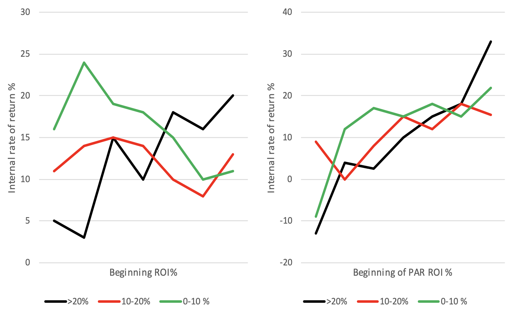
Figure 1: Investment success as a function of starting position
The sample comes from the Profit Impact of Market Strategy® (PIMS®) program which has been established (originally at GE, then at the Marketing Science Institute at HBS) for over 40 years across a wide range of industries and geographies. The PIMS® databases comprise over 25’000 years of business experience at the Strategic Business Unit (SBU) level (i.e. where the client interface takes place and where marketing andinvestment decision are made). Each SBU is characterized over 4+ years by hundreds of factors including its and its competitors’ market shares, customer preference, relative pricing, service quality, innovation rate, vertical integration, etc., as well a range of market attractiveness factors and fairly detailed income statement, balance sheet, and employee data.
The vertical axis of the chart above is the internal rate of return (IRR), which measures the shareholders’ per annum (p.a.) percentage growth rate in wealth from buying a business in year 1, running it for 4 years, getting its free cash flow, and selling it in year 4 (the IRR is the “annualized effective compounded return rate” that makes the net present value of all cash flows from a particular investment equal to zero). The IRR is one of the main criteria used e.g. in Private Equity to determine investment performance. The buying and selling prices are set using profit and asset multiples calibrated against stock market data.
The PIMS data set has been split into four groups:
- Businesses investing “heavily”: net assets (i.e. capital employed) growing faster than 20% p.a. over the 4-year period.
- Businesses investing “somewhat”: net as-sets growing at 10 to 20%.
- Businesses investing “modestly”: net as-sets growing at 0 to 10%.
- Businesses disinvesting: net assets declining.
The fourth group were omitted from the charts since the interest is where to invest, not where to disinvest (also, another reason for leaving them off was graphical noise and confusion: see below). Each remaining group is one line on each chart.
For the left hand chart, the businesses are lined up along the horizontal axis according to their ROI (EBIT as % of net assets) at the beginning of the four years: those with negative ROI worse than -10% are on the left, then those with -10% to 0%, and so on in increments of 10%. There is a certain amount of up-and-down zig- zag due to sample sizes, but the trend is clear: the lines are basically flat, it is generally no better to invest in a business starting at 50% ROI than one starting at -10% ROI (only the heavy investors show a slight positive slope). Investing in “winners” means you always invest at the peak of the cycle, you never invest in a start-up business, but occasionally hit the spot. One might as well use a dartboard for investment decisions.
For the right hand chart, the businesses are lined up horizontally instead according to their par ROI at the beginning of the four years. This is their expected ROI based on a statistical model of their competitive strength, market attractiveness, and supply chain fitness. Although par ROI is correlated 80% with actual ROI, nevertheless the order is different enough to show remarkably different results. All three lines have a strong positive slope, with the slope strongest for the heavy investors. So although the par ROI equation was developed mainly as a diagnostic benchmark for current profitability, it turns out to be the best predictor available for future in-vestment success. Competitive strength and supply chain fitness have the biggest weights in the par ROI equation (each of those categories is captured in many different metrics).
Regarding the disinvestors, in theory it should (i) create wealth to take cash out of a bad business, and (ii) destroy wealth to disinvest in a good business. However, in reality quite a few high-par businesses create wealth even for those ignorant enough not to invest in them, so the statistics are inconclusive. Vice versa, it is more fruitful to sell a low-par business than run it for cash (buyers will buy on the basis of actual ROI).
We could also do the right hand chart lining up businesses by market size or market growth. Market size requires some heroic estimation, but the evidence is that market size has a negative correlation with IRR. Market growth does have a positive correlation, but it is much weaker than par ROI. As an investor, beware of corporations going for “large, growing, profitable” markets because they will probably waste your money.
Please click here to download the article as a PDF.